
Our Work

Explore our portfolio to see the innovative projects we’ve brought to life. From branding to digital experiences, each project reflects our commitment to creativity and excellence
Exploring the Creative Journey Behind Our Inspiring Work
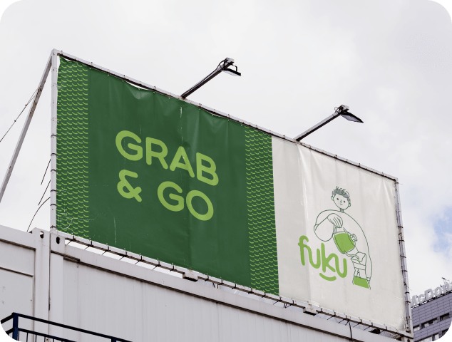
Our challenge was ensuring the brand name “FUKU” was pronounced correctly, avoiding any potential misunderstanding as “FUK U.” To address this, we took a creative approach, designing a logo that eliminates ambiguity while embodying the brand’s essence of happiness and good fortune, derived from the Japanese word “Fuku.” A defining feature of the logo is a smile beneath the name, symbolizing joy and aligning perfectly with the brand’s core message.
Our challenge was ensuring the brand name “FUKU” was pronounced correctly, avoiding any potential misunderstanding as “FUK U.” To address this, we took a creative approach, designing a logo that eliminates ambiguity while embodying the brand’s essence of happiness and good fortune, derived from the Japanese word “Fuku.” A defining feature of the logo is a smile beneath the name, symbolizing joy and aligning perfectly with the brand’s core message.
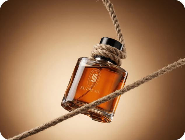
We were entrusted with crafting a brand identity for Supreme, a company dedicated to delivering luxurious perfumes and aftershaves without the premium price tag. Guided by their mission, we built a narrative that reflects sophistication, confidence, and accessibility. Supreme’s high-quality fragrances are designed with precision and care, offering timeless scents that inspire elegance while breaking the notion that luxury must come at an exorbitant cost.
Our approach positioned Supreme as more than just a fragrance brand—it’s a movement to redefine the luxury market. With a vision to become a global leader, Supreme aims to create a lasting impact by making premium fragrances accessible to all. Whether it’s a signature scent that captures individuality or a versatile fragrance for everyday wear, Supreme delivers an unparalleled sensory experience that blends style, affordability, and quality seamlessly.
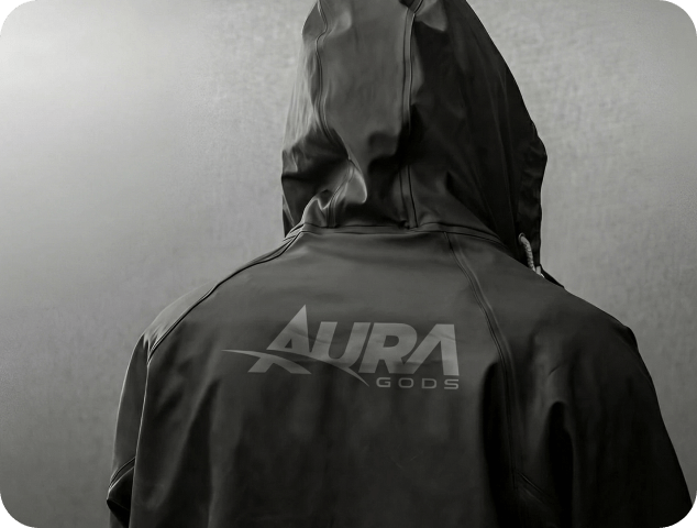
As a creative agency, we set out to capture the essence of Aura Gods, a premium fitness supplement brand rooted in aspiration and performance. Our goal was to design a brand identity that reflects the transformative power of fitness while resonating with individuals striving to unlock their potential.
Drawing inspiration from the pillars of strength, resilience, and motion, we crafted a sleek, minimalist aesthetic that mirrors the brand’s commitment to excellence and precision. Clean lines and modern typography evoke discipline and confidence, while a bold, energizing color palette symbolizes vitality and power. From the logo to the packaging, every element was designed to make a statement, conveying premium quality and inspiring greatness.
Aura Gods isn’t just a supplement company; it’s a lifestyle and a movement. Through strategic design and motivational messaging, we delivered a cohesive brand experience that empowers individuals to push their limits and embrace transformation. By blending storytelling with cutting-edge visuals, we positioned Aura Gods as a leader in the fitness supplement industry—fueling journeys and inspiring strength at every step.
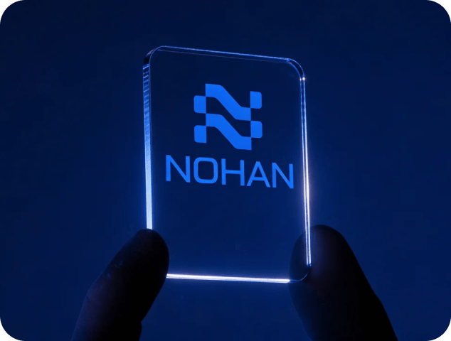
When designing Nohan’s visual identity, we sought to capture their core values: innovation, connectivity, and adaptability. The result is a sleek, interwoven “N,” created by merging a parallelogram with the letter “N.” This bold mark symbolizes seamless integration and the flow of technology.
The vibrant blue gradient reinforces trust and progress, while the clean, modern design highlights Nohan’s position as a leader in cutting-edge IT solutions. This logo serves as a powerful representation of Nohan’s mission to drive progress in a digitally connected world.
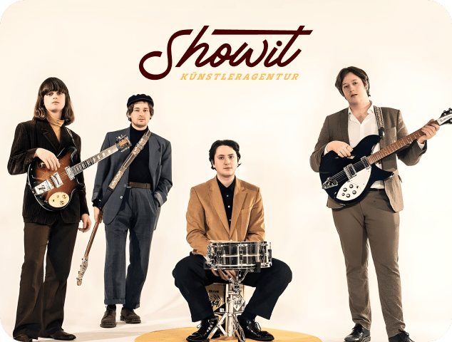
For Show It, a brand that blends the letter ‘S’ with a music symbol in its logo, we aimed to capture the energy and creativity of the platform. Our design approach highlights both artistic expression and innovation, creating a sleek and modern identity that resonates with creators and music enthusiasts.
Drawing inspiration from rhythm and movement, we used clean lines and a bold, dynamic color palette to convey creativity and precision. The logo, combining sound and style, reflects the brand’s fusion of music and creativity.
Show It isn’t just a platform—it’s a space where creators can amplify their work. With a fresh, minimalist design, we positioned Show It as a leader in the creative space, empowering users to showcase their talents.

For Virgilio, a celebrated artist known for his southern flair and captivating performances, we crafted a brand identity that reflects his vibrant energy and timeless appeal. Drawing inspiration from his Italian roots and diverse music catalog, we developed a sleek, elegant design that speaks to both his entertainment legacy and his ability to connect with audiences through iconic songs like Azzurro and Sempre Sempre.
Virgilio isn’t just a performer—he’s an experience. With a refined yet warm color palette and a modern logo, we created a brand that mirrors his dynamic presence, positioning him as the go-to artist for unforgettable events. Whether performing in Italy or at Europa-Park in Rust, Virgilio’s music brings a touch of Italian joie de vivre to every occasion.