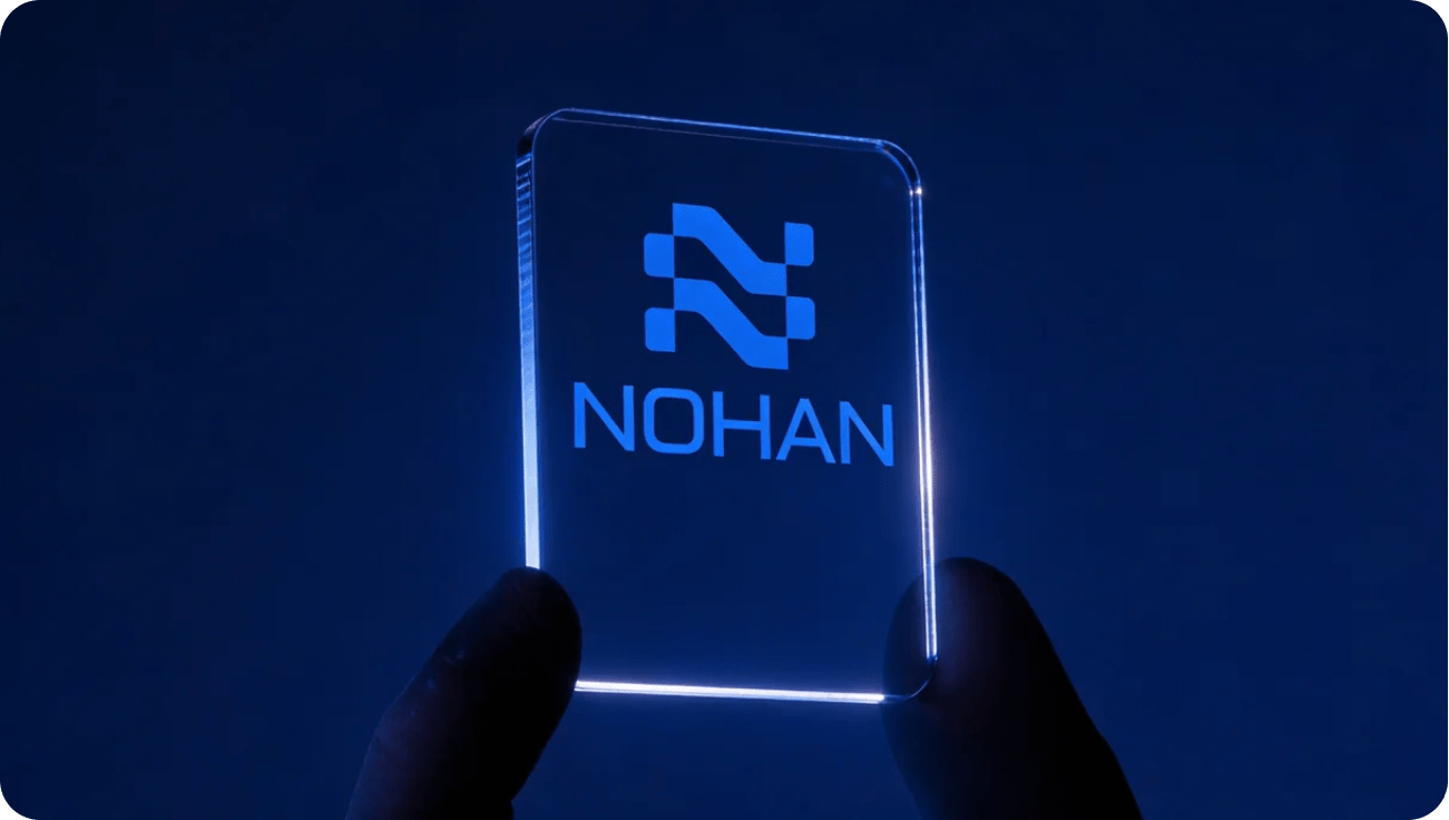
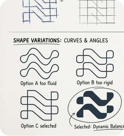
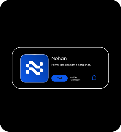
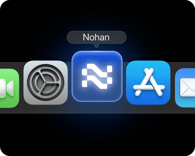
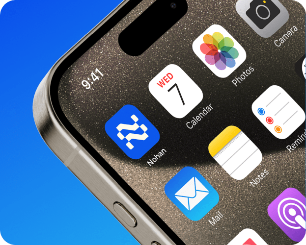
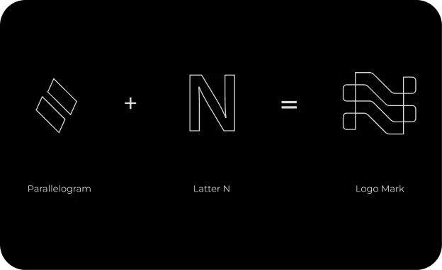
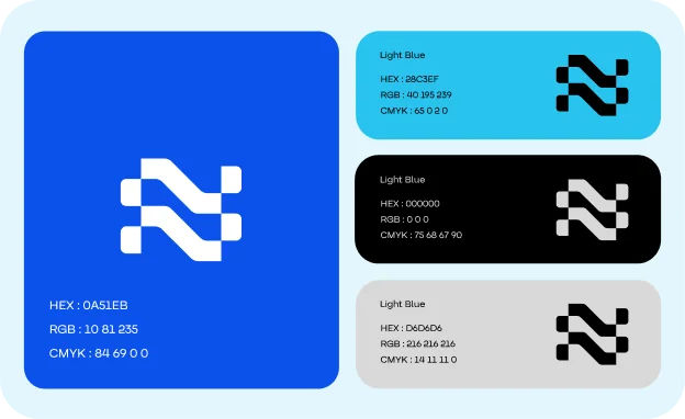
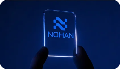
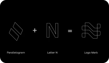
When designing Nohan’s visual identity, we sought to capture their core values: innovation, connectivity, and adaptability. The result is a sleek, interwoven “N,” created by merging a parallelogram with the letter “N.” This bold mark symbolizes seamless integration and the flow of technology.
The vibrant blue gradient reinforces trust and progress, while the clean, modern design highlights Nohan’s position as a leader in cutting-edge IT solutions. This logo serves as a powerful representation of Nohan’s mission to drive progress in a digitally connected world.
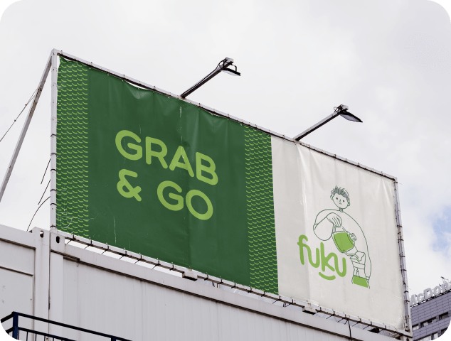
Our challenge was ensuring the brand name “FUKU” was pronounced correctly, avoiding any potential misunderstanding as “FUK U.” To address this, we took a creative approach, designing a logo that eliminates ambiguity while embodying the brand’s essence of happiness and good fortune, derived from the Japanese word “Fuku.” A defining feature of the logo is a smile beneath the name, symbolizing joy and aligning perfectly with the brand’s core message.
Our challenge was ensuring the brand name “FUKU” was pronounced correctly, avoiding any potential misunderstanding as “FUK U.” To address this, we took a creative approach, designing a logo that eliminates ambiguity while embodying the brand’s essence of happiness and good fortune, derived from the Japanese word “Fuku.” A defining feature of the logo is a smile beneath the name, symbolizing joy and aligning perfectly with the brand’s core message.
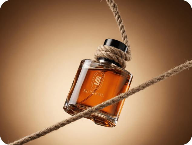
We were entrusted with crafting a brand identity for Supreme, a company dedicated to delivering luxurious perfumes and aftershaves without the premium price tag. Guided by their mission, we built a narrative that reflects sophistication, confidence, and accessibility. Supreme’s high-quality fragrances are designed with precision and care, offering timeless scents that inspire elegance while breaking the notion that luxury must come at an exorbitant cost.
Our approach positioned Supreme as more than just a fragrance brand—it’s a movement to redefine the luxury market. With a vision to become a global leader, Supreme aims to create a lasting impact by making premium fragrances accessible to all. Whether it’s a signature scent that captures individuality or a versatile fragrance for everyday wear, Supreme delivers an unparalleled sensory experience that blends style, affordability, and quality seamlessly.