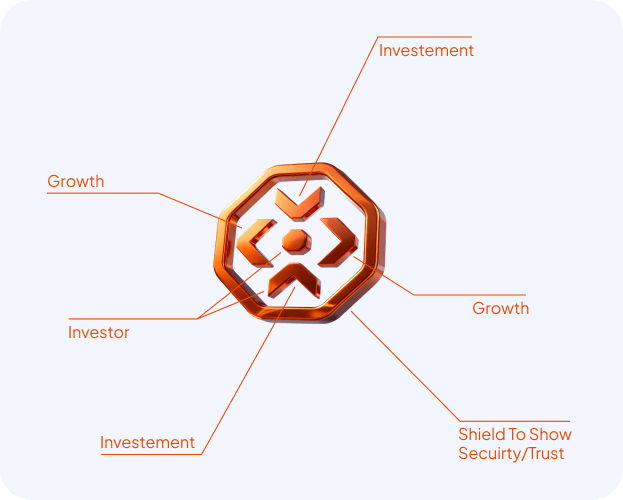
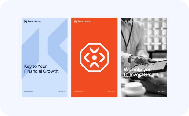
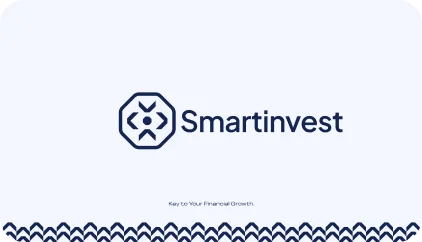
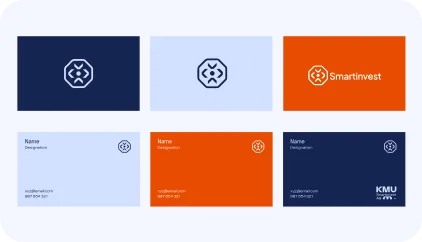
The Smartinvest branding reflects a modern, innovative approach to financial growth and investment. The logo, featuring a geometric design and vibrant colors like orange and navy, communicates a sense of stability, trust, and forward-thinking financial strategies. The clean, structured design is complemented by dynamic visuals that emphasize Smartinvest’s commitment to guiding clients toward smart, calculated investment decisions. The use of bold typography and a strong color palette enhances the brand’s professional yet approachable image, appealing to both seasoned investors and newcomers.
This branding centers on Smartinvest’s mission to empower clients in their financial journeys. The visual identity highlights clarity and precision, with modern digital applications like websites and mobile interfaces that ensure a seamless user experience. The combination of blue and orange signifies trust, energy, and growth, reinforcing the brand’s promise to help clients achieve sustainable financial success. With a focus on accessibility and innovation, Smartinvest stands out as a reliable partner in the financial world, providing intelligent investment solutions for long-term growth.
Our challenge was ensuring the brand name “FUKU” was pronounced correctly, avoiding any potential misunderstanding as “FUK U.” To address this, we took a creative approach, designing a logo that eliminates ambiguity while embodying the brand’s essence of happiness and good fortune, derived from the Japanese word “Fuku.” A defining feature of the logo is a smile beneath the name, symbolizing joy and aligning perfectly with the brand’s core message.
Our challenge was ensuring the brand name “FUKU” was pronounced correctly, avoiding any potential misunderstanding as “FUK U.” To address this, we took a creative approach, designing a logo that eliminates ambiguity while embodying the brand’s essence of happiness and good fortune, derived from the Japanese word “Fuku.” A defining feature of the logo is a smile beneath the name, symbolizing joy and aligning perfectly with the brand’s core message.
We were entrusted with crafting a brand identity for Supreme, a company dedicated to delivering luxurious perfumes and aftershaves without the premium price tag. Guided by their mission, we built a narrative that reflects sophistication, confidence, and accessibility. Supreme’s high-quality fragrances are designed with precision and care, offering timeless scents that inspire elegance while breaking the notion that luxury must come at an exorbitant cost.
Our approach positioned Supreme as more than just a fragrance brand—it’s a movement to redefine the luxury market. With a vision to become a global leader, Supreme aims to create a lasting impact by making premium fragrances accessible to all. Whether it’s a signature scent that captures individuality or a versatile fragrance for everyday wear, Supreme delivers an unparalleled sensory experience that blends style, affordability, and quality seamlessly.