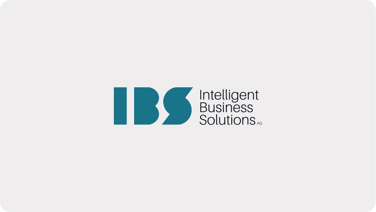
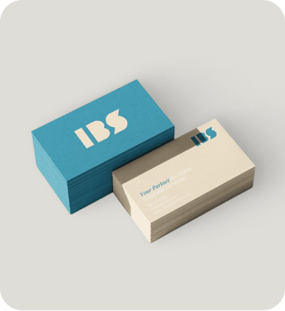
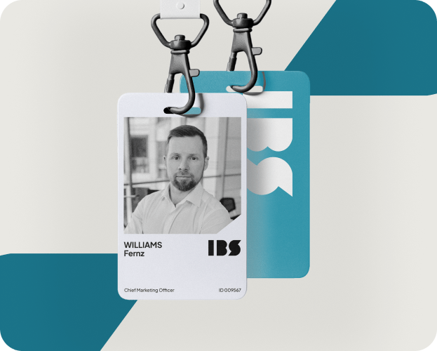
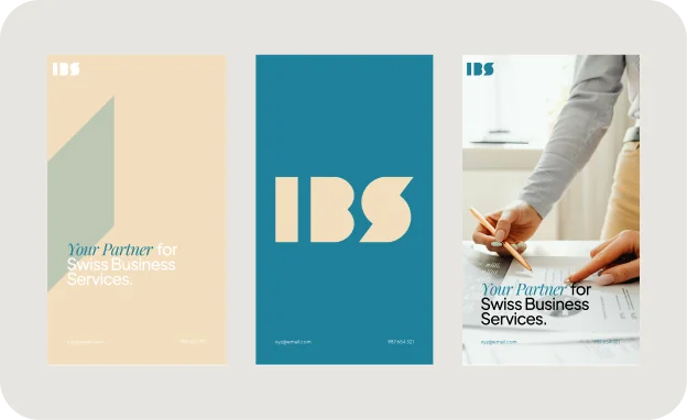
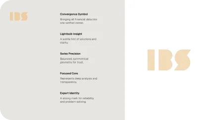
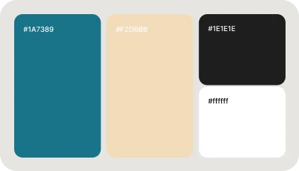
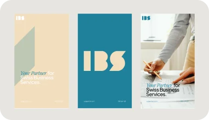
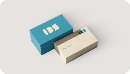
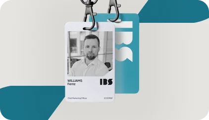
The IBS branding combines a professional and modern approach with a clean, structured design that communicates trust and reliability. The logo, featuring bold typography with a strong, geometric style, embodies the brand’s focus on precision and efficiency. The color palette of deep teal and soft beige evokes a sense of calm, professionalism, and sophistication, while still being approachable. This minimalist design reflects IBS’s dedication to offering high-quality services in Swiss business assurance, making the brand instantly recognizable and impactful.
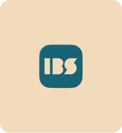
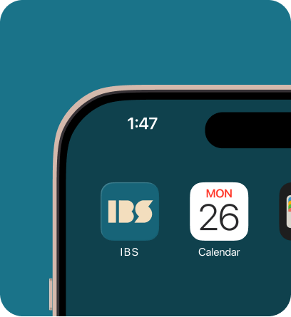
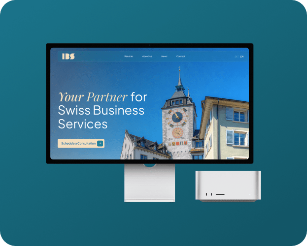
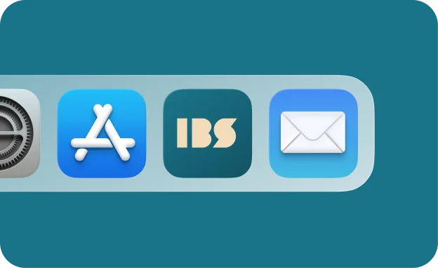
The brand identity is designed to convey clarity and expertise, with its streamlined visual style extending seamlessly across digital platforms, including websites and mobile interfaces. The consistent use of typography and color ensures that the brand maintains its professional image across all touchpoints. IBS positions itself as a reliable partner in Swiss business services, offering accuracy and dependability with a polished and contemporary look. The design speaks to clients who value professionalism and trust in managing their business needs, reinforcing IBS as a top choice for business assurance.
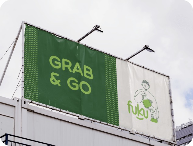
Our challenge was ensuring the brand name “FUKU” was pronounced correctly, avoiding any potential misunderstanding as “FUK U.” To address this, we took a creative approach, designing a logo that eliminates ambiguity while embodying the brand’s essence of happiness and good fortune, derived from the Japanese word “Fuku.” A defining feature of the logo is a smile beneath the name, symbolizing joy and aligning perfectly with the brand’s core message.
Our challenge was ensuring the brand name “FUKU” was pronounced correctly, avoiding any potential misunderstanding as “FUK U.” To address this, we took a creative approach, designing a logo that eliminates ambiguity while embodying the brand’s essence of happiness and good fortune, derived from the Japanese word “Fuku.” A defining feature of the logo is a smile beneath the name, symbolizing joy and aligning perfectly with the brand’s core message.
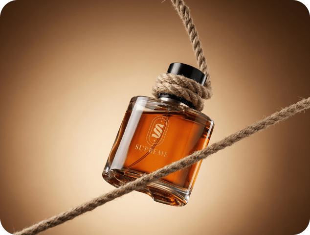
We were entrusted with crafting a brand identity for Supreme, a company dedicated to delivering luxurious perfumes and aftershaves without the premium price tag. Guided by their mission, we built a narrative that reflects sophistication, confidence, and accessibility. Supreme’s high-quality fragrances are designed with precision and care, offering timeless scents that inspire elegance while breaking the notion that luxury must come at an exorbitant cost.
Our approach positioned Supreme as more than just a fragrance brand—it’s a movement to redefine the luxury market. With a vision to become a global leader, Supreme aims to create a lasting impact by making premium fragrances accessible to all. Whether it’s a signature scent that captures individuality or a versatile fragrance for everyday wear, Supreme delivers an unparalleled sensory experience that blends style, affordability, and quality seamlessly.