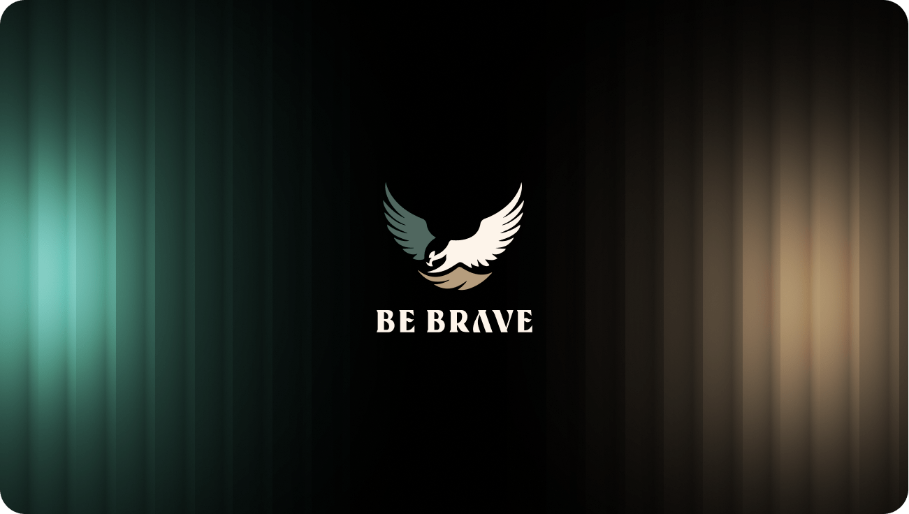
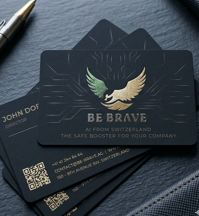
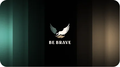
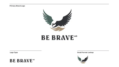
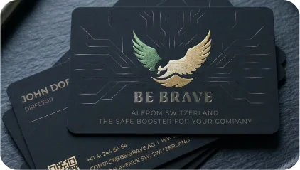
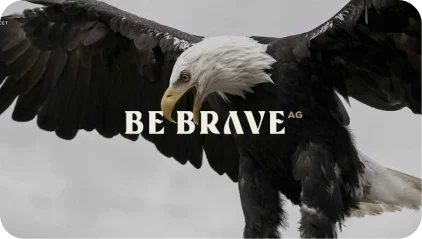
The eagle emblem at the heart of BE BRAVE’s identity is a powerful symbol of strength, vision, and fearless ambition. Its wings spread wide in bold tricolor — deep forest green, warm tan, and crisp cream — against a commanding black canvas, capturing the spirit of a company that soars above limitations and confronts challenges head-on. The eagle’s downward gaze speaks to focus, precision, and the relentless pursuit of excellence.
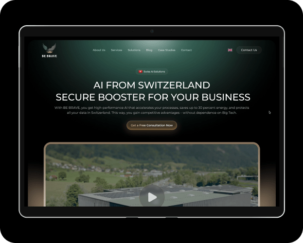
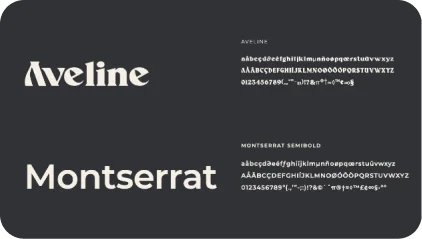
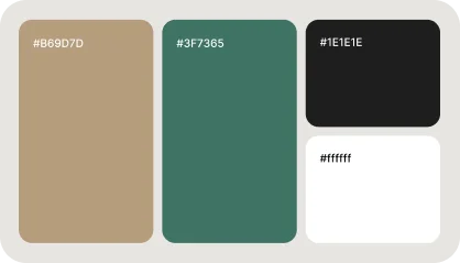
The BE BRAVE branding builds on this foundation, blending bold confidence with refined Swiss precision through strong typography and a purposeful color palette. This powerful aesthetic targets an audience that values trust, innovation, and sovereignty — reflecting the brand’s commitment to cutting-edge AI technology built on uncompromising integrity. The cohesive identity empowers its audience, offering an AI experience that is both transformative and fully secure — embodying the perfect balance of innovation and trust.
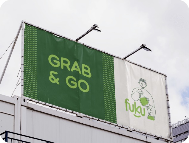
Our challenge was ensuring the brand name “FUKU” was pronounced correctly, avoiding any potential misunderstanding as “FUK U.” To address this, we took a creative approach, designing a logo that eliminates ambiguity while embodying the brand’s essence of happiness and good fortune, derived from the Japanese word “Fuku.” A defining feature of the logo is a smile beneath the name, symbolizing joy and aligning perfectly with the brand’s core message.
Our challenge was ensuring the brand name “FUKU” was pronounced correctly, avoiding any potential misunderstanding as “FUK U.” To address this, we took a creative approach, designing a logo that eliminates ambiguity while embodying the brand’s essence of happiness and good fortune, derived from the Japanese word “Fuku.” A defining feature of the logo is a smile beneath the name, symbolizing joy and aligning perfectly with the brand’s core message.
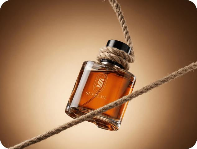
We were entrusted with crafting a brand identity for Supreme, a company dedicated to delivering luxurious perfumes and aftershaves without the premium price tag. Guided by their mission, we built a narrative that reflects sophistication, confidence, and accessibility. Supreme’s high-quality fragrances are designed with precision and care, offering timeless scents that inspire elegance while breaking the notion that luxury must come at an exorbitant cost.
Our approach positioned Supreme as more than just a fragrance brand—it’s a movement to redefine the luxury market. With a vision to become a global leader, Supreme aims to create a lasting impact by making premium fragrances accessible to all. Whether it’s a signature scent that captures individuality or a versatile fragrance for everyday wear, Supreme delivers an unparalleled sensory experience that blends style, affordability, and quality seamlessly.